Developing a Visual Brand Identity takes center stage, inviting readers into a world of design and creativity that shapes consumer perception and brand recognition.
From the importance of visual elements to the psychology of colors and the role of typography, this topic delves deep into the art of creating a cohesive and impactful brand image.
Importance of Visual Brand Identity
Visual brand identity plays a crucial role in the success of businesses by helping them stand out in a crowded market and creating a lasting impression on consumers. A strong visual brand identity conveys the values, personality, and essence of a company, establishing a connection with the target audience and building brand loyalty.
Examples of Successful Companies
- Apple: Known for its minimalist design and sleek aesthetics, Apple has a strong visual brand identity that reflects innovation and sophistication.
- Nike: With its iconic swoosh logo and bold branding elements, Nike has successfully positioned itself as a symbol of athleticism and empowerment.
- Coca-Cola: The classic red and white colors, along with the timeless logo, have helped Coca-Cola maintain a strong visual brand identity that is instantly recognizable worldwide.
Impact on Consumer Perception
A well-developed visual brand identity can significantly influence how consumers perceive a brand. It can evoke emotions, create brand recall, and differentiate a company from its competitors. Consistent branding across various touchpoints can enhance brand credibility and trust, leading to increased customer loyalty and preference.
Elements of Visual Brand Identity
Visual brand identity is made up of key elements that work together to create a cohesive brand image and communicate brand values and messaging effectively.
Logo
The logo is a visual representation of a brand and is often the first thing that comes to mind when thinking about a company or product. It serves as a symbol that helps consumers recognize and remember the brand. Logos can be iconic, logotypes, or a combination of both, and they play a crucial role in creating brand recognition and differentiation.
Color Palette
Colors evoke emotions and have the power to influence how a brand is perceived. A carefully chosen color palette can help communicate brand personality, evoke specific feelings, and create a memorable visual impact. Consistent use of colors across all brand touchpoints helps strengthen brand recognition and build brand association with certain emotions or characteristics.
Typography, Developing a Visual Brand Identity
Typography refers to the style, size, and arrangement of text used in brand communications. It plays a significant role in conveying brand tone, personality, and overall aesthetic. The right typography can enhance readability, establish hierarchy, and evoke specific emotions. Consistent use of typography helps reinforce brand identity and maintain a cohesive visual language across all brand materials.
Designing a Logo: Developing A Visual Brand Identity
When it comes to designing a logo that effectively represents a brand, there are several key factors to consider. A logo is often the first thing that a potential customer will notice about a brand, so it needs to make a strong and memorable impression.
Importance of Simplicity, Versatility, and Memorability
- Simplicity: A simple logo is easier to recognize and remember. Avoid clutter and complex designs that may be difficult to reproduce in different sizes or formats.
- Versatility: A good logo should be able to adapt to various applications, from business cards to billboards. Make sure it looks great in color, black and white, and even in small sizes.
- Memorability: A logo should leave a lasting impression on viewers. Aim for a design that is unique, impactful, and conveys the essence of the brand.
Tips for Creating a Timeless Logo
- Focus on Core Values: Understand the brand’s identity, values, and target audience before starting the design process.
- Keep it Simple: Avoid using trendy elements or complex graphics that may become outdated quickly. Opt for clean and timeless designs.
- Avoid Overcomplication: Don’t overcrowd the logo with unnecessary details or elements. A clutter-free design stands the test of time.
- Seek Feedback: Get input from colleagues, clients, or focus groups to ensure the logo resonates with the intended audience.
- Think Long-Term: Consider how the logo will look in different contexts and environments, both now and in the future.
Choosing a Color Palette

When it comes to developing a visual brand identity, choosing the right color palette is crucial in creating a strong and memorable brand image. Colors play a significant role in influencing consumer perception and can evoke specific emotions and feelings.
Psychology of Colors
- Red: Often associated with passion, energy, and excitement. Brands like Coca-Cola and Target use red to convey a sense of urgency and boldness.
- Blue: Symbolizes trust, reliability, and calmness. Companies like Facebook and IBM use blue to instill a sense of professionalism and security.
- Yellow: Represents optimism, happiness, and creativity. Brands like McDonald’s and Best Buy use yellow to create a cheerful and vibrant image.
- Green: Signifies growth, nature, and freshness. Companies like Starbucks and Whole Foods use green to convey a sense of health and sustainability.
Selecting a Color Palette
- Consider the brand’s personality and values when choosing colors.
- Think about the target audience and what colors would resonate with them.
- Aim for a cohesive color palette that is visually appealing and consistent across all brand assets.
Examples of Effective Color Usage
- Apple: Uses a sleek and minimalist color palette of white, black, and silver to convey a sense of sophistication and innovation.
- Nike: Incorporates the iconic combination of black and white with pops of vibrant colors like red and orange to represent energy and empowerment.
- Tiffany & Co.: Utilizes a signature shade of blue known as “Tiffany Blue” to evoke feelings of luxury, elegance, and exclusivity.
Typography and Brand Voice

Typography plays a crucial role in reinforcing a brand’s identity and voice. The fonts chosen for a brand’s visual elements can convey specific emotions, attitudes, and perceptions to the audience. Different fonts have unique characteristics that can impact how a brand is perceived by consumers.
Role of Typography in Brand Identity
Typography sets the tone for brand communication and messaging. It helps establish the brand’s personality and overall image. Whether a brand wants to appear modern, traditional, playful, or serious, the choice of typography can greatly influence how the brand is perceived by the target audience.
- Fonts with clean lines and simple shapes can convey a sense of minimalism and sophistication.
- Script fonts can evoke a feeling of elegance and femininity.
- Bold, sans-serif fonts can project strength and confidence.
Choosing Typography for Brand Image
When selecting typography for a brand, it is essential to consider how different fonts align with the brand’s values, target audience, and overall aesthetic. Here are some guidelines for choosing typography that complements the brand’s image:
- Ensure consistency: Use a cohesive set of fonts across all brand materials to maintain a unified identity.
- Consider readability: Select fonts that are legible and easy to read, especially in digital formats.
- Reflect brand personality: Choose fonts that reflect the brand’s personality and values to create a cohesive brand voice.
- Avoid trends: Opt for timeless fonts that will remain relevant and recognizable over time.
Visual Consistency Across Platforms
Visual consistency across various marketing channels is crucial for building brand recognition and trust among consumers. When a brand maintains a consistent visual identity, it helps to reinforce brand values, messaging, and overall brand image. Whether it’s print materials, digital platforms, or social media, having a cohesive visual identity strengthens brand recall and can lead to increased customer loyalty.
Strategies for Ensuring Brand Coherence
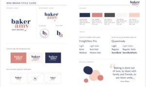
- Develop Brand Guidelines: Create a comprehensive style guide that Artikels rules for logo usage, color schemes, typography, and imagery across all platforms.
- Use Consistent Visual Elements: Ensure that your brand’s visual elements, such as logos, graphics, and imagery, are consistent in style and tone across different mediums.
- Adapt to Different Formats: While maintaining consistency, be flexible in adapting visual elements to fit the specific requirements of each platform without compromising brand identity.
- Monitor and Update Regularly: Regularly review and update visual assets to ensure they align with current design trends and remain relevant to your target audience.
Examples of Brands with Consistent Visual Branding
- Apple: Known for its minimalist design approach, Apple maintains consistency in its sleek and simple visual elements across all marketing channels.
- Coca-Cola: With its iconic red and white color scheme, Coca-Cola has successfully implemented consistent branding across print, digital, and social media platforms.
- Nike: Nike’s swoosh logo and bold typography are instantly recognizable, demonstrating a strong visual identity that remains consistent across various marketing channels.


